Re: [drupal-devel] New themeable function for buttons?

I think the confirm link next to the button is ugly too and I think making the delete button a link would be a big step backwards in user friendliness.
I agree with this, even though I can't find any "proof" that the link method is wrong. I personally like the button approach better too... Regards, Kobus

One more thought on the topic: When you offer the user two choices {Confirm | Cancel} they should both use the same interface. If they were both links I'd be disappointed but would get used to it. Mixing them up is what seems so wrong. -Robert

On Thu, Jul 07, 2005 at 08:50:24AM +0200, Robert Douglass wrote:
When you offer the user two choices {Confirm | Cancel} they should both use the same interface. If they were both links I'd be disappointed but would get used to it. Mixing them up is what seems so wrong.
They would certainly never both be links. That would be wrong for user expectations (buttons do things, links don't) and would have technical issues with various browsers, robots, and accelerators doing things unintentionally. -Neil

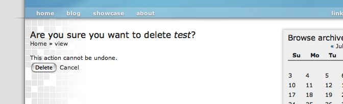
I just want it to be consistent. If we are forced to use buttons somewhere, because there is no other way, then so be it. But please let it be consistent, and not as we see in the screenshot underneath. I think this is a really bad thing. It doesn't look right and doesn't feel right. Some improvements would be: - if both actions 'Delete' and 'Cancel' would be buttons; - if the buttons would be right aligned (every good OS does that); - if the breadcrumbs were a little more descriptive and reflect the real path; So, +1 on having them both buttons. On the confirmation api (we should patch that again), and in any other section of drupal.. But, no matter what we do, we have to keep it consistent to get drupal on a higher level of usability and userfriendlyness! Kind regards, Stefan Op 7-jul-2005, om 6:12 heeft neil@civicspacelabs.org het volgende geschreven:
On Thu, Jul 07, 2005 at 08:50:24AM +0200, Robert Douglass wrote:
When you offer the user two choices {Confirm | Cancel} they should both use the same interface. If they were both links I'd be disappointed but would get used to it. Mixing them up is what seems so wrong.
They would certainly never both be links. That would be wrong for user expectations (buttons do things, links don't) and would have technical issues with various browsers, robots, and accelerators doing things unintentionally.
-Neil

Stefan, IMO the only thing wrong in that screenshot is that your links are not clearly links. Please give good *reasons* for changing it to a button. "It does not look right" is not a reason, its an subjective statement. For now the only reason i heardhas been that it is inconsistent. Which is a good one. The reason against this being a button is that it is not an action. Going to a location is done with links; performing an action is done with a button. I guess the debate here thus should be: "is canceling an action" and "should these two be consistent in the first place". And not "Do i like how it looks" for we cannot debate what one likes. I beleive cancelling is not an action, not as we present it anyway. And i thus think these two must not be consistent, for they do completely different things. And different things must show that difference. Regards, Bèr -- [ Bèr Kessels | Drupal services www.webschuur.com ]
Op donderdag 07 juli 2005 08:50, schreef Robert Douglass:
One more thought on the topic:
When you offer the user two choices {Confirm | Cancel} they should both use the same interface. If they were both links I'd be disappointed but would get used to it. Mixing them up is what seems so wrong.
Its indeed the inconsistency that makes it feel annoying. In the beginning. We are so used to our desktop applications having buttons for links, that we expect to see them everywhere. When we get to a place (Drupal) were we see the correct behaviour, we think this is wrong. An de-facto standard is still a standard. But not all standards are the best behaviour. So far, Robert, you are the only one that brought up any good reasons for having a button. I think if we can get a few more of these valid reasons it is worth discussion. An "I don't like it" is not a valid reason. It a fact. So please people, come up with arguments on why to change this back to a button. Regards, Bèr -- [ Bèr Kessels | Drupal services www.webschuur.com ]

On Thu, 7 Jul 2005, Robert Douglass wrote:
One more thought on the topic:
When you offer the user two choices {Confirm | Cancel} they should both use the same interface. If they were both links I'd be disappointed but would get used to it. Mixing them up is what seems so wrong.
The point about one being a link and one being a button is that both actions are _not_ equivalent. Users are most likely looking at the form _because_ they want to delete (or do whatever) something, not because they want to cancel their action. At first I didn't like the form too, but I am now convinced that it is a good thing. Cheers, Gerhard
Op donderdag 07 juli 2005 12:28, schreef Gerhard Killesreiter:
At first I didn't like the form too, but I am now convinced that it is a good thing.
Which underlines my point that most of us dislike it because they are used to seeing it differently. After having used it for a while in Drupal, I find that a lot of people actually like it a lot. And that they start disliking the way desktops handle it. Regards, Bèr -- [ Bèr Kessels | Drupal services www.webschuur.com ]
The fact that Cancel uses a GET request and not a POST request is not a valid argument for how to design the user interface. One of the problems with the cancel link is that it says cancel. That is definitely an non-navigation action and I prefer buttons for that type of action. If the link said "go somewhere else with the side-effect that your content won't be deleted", then it would be clear to me that it was a navigation link. One way or another, we expect the user to click one of the two elements to end the transaction that they started with Delete. The two options should be equal. People accidentally click Delete sometimes and the reason we offer a cancel is so that they can have recourse of not deleting (and feel confident about it too, since they could simply hit Home and achieve the same). We shouldn't try to guess that the user probably wants to click Delete and therefore it should stick out more. I don't have any experience browsing web sites as if I were visually impaired; how do people use buttons in those cases? Surely a normal HTML button can't be a useability obstacle for that user group? In the end, it is the consistency that is the most important to me. Make them both the same kind of interface and I'll learn to live with it. Finding more opportunities to mix up links and buttons is a bad idea. Robert
participants (6)
-
 Bèr Kessels
 -
 Gerhard Killesreiter
 -
 Kobus Myburgh
 -
 neil@civicspacelabs.org
 -
 Robert Douglass
 -
 Stefan Nagtegaal