
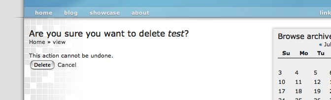
I just want it to be consistent. If we are forced to use buttons somewhere, because there is no other way, then so be it. But please let it be consistent, and not as we see in the screenshot underneath. I think this is a really bad thing. It doesn't look right and doesn't feel right. Some improvements would be: - if both actions 'Delete' and 'Cancel' would be buttons; - if the buttons would be right aligned (every good OS does that); - if the breadcrumbs were a little more descriptive and reflect the real path; So, +1 on having them both buttons. On the confirmation api (we should patch that again), and in any other section of drupal.. But, no matter what we do, we have to keep it consistent to get drupal on a higher level of usability and userfriendlyness! Kind regards, Stefan Op 7-jul-2005, om 6:12 heeft neil@civicspacelabs.org het volgende geschreven:
On Thu, Jul 07, 2005 at 08:50:24AM +0200, Robert Douglass wrote:
When you offer the user two choices {Confirm | Cancel} they should both use the same interface. If they were both links I'd be disappointed but would get used to it. Mixing them up is what seems so wrong.
They would certainly never both be links. That would be wrong for user expectations (buttons do things, links don't) and would have technical issues with various browsers, robots, and accelerators doing things unintentionally.
-Neil