
Are you saying this just because sepeck took his screenshot at an unusually wide browser width? Otherwise, I don't get what you mean by
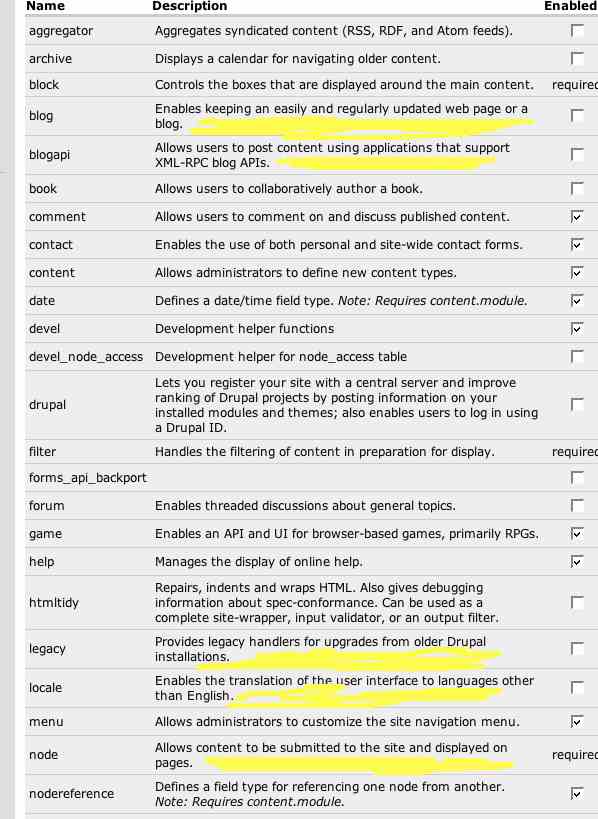
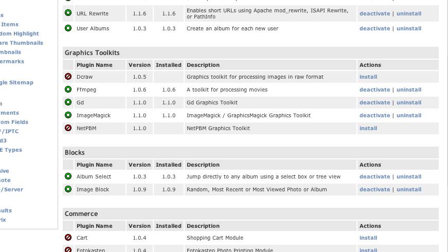
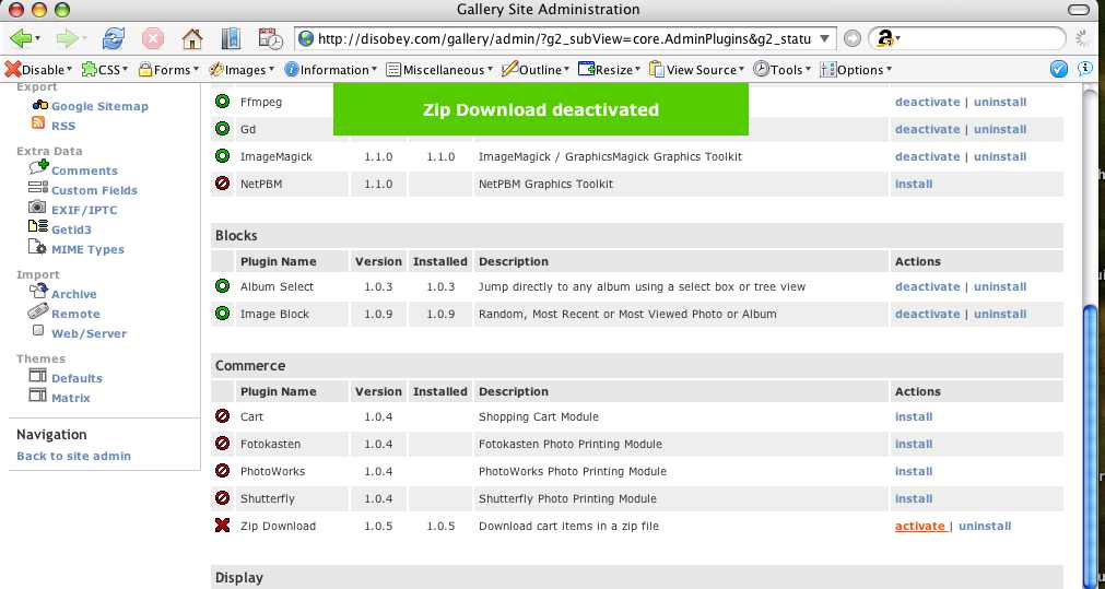
Some screenshots to prevent the thousand words thing. Low quality. wordwrap.jpg: An example of our current modules screen at a small width. The yellow areas are hideous to me - the word wrapping of one word is bad, and harms readability, IMO. The extra columns and links in your screenshot would make word wrapping common place. gallery2_before.jpg: The gallery2 plugin screen. Notice the three install states that you may have heard Earl and I talking about in the past. Per the Wordpress screenshot, these are actually links, not buttons, but same diff. gallery2_after.jpg: After clicking the "install" link, three things happen at once. First, "zip download" row is highlighted green temporarily (not shown in this screenshot - it fades out). A notice appears at the top of the page, also in green, which also fades out. Also, the links turn from "install" to "activate" and "uninstall". Also note that the state of the icons replaces the visual "enabled check in a checkbox". It actually appears Gallery 2 has five states: install, activate, deactivate, uninstall, and a rare "configure" (for when you activate a module but it /requires/ admin configuration before it will do anything useful). I'm not sure we need to deviate from our three states (most of our modules require some sort of configuration before use). -- Morbus Iff ( rootle-dee-tootle-dee-toot! ) Technical: http://www.oreillynet.com/pub/au/779 Culture: http://www.disobey.com/ and http://www.gamegrene.com/ icq: 2927491 / aim: akaMorbus / yahoo: morbus_iff / jabber.org: morbus