
28 Sep
2006
28 Sep
'06
3:42 p.m.
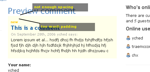
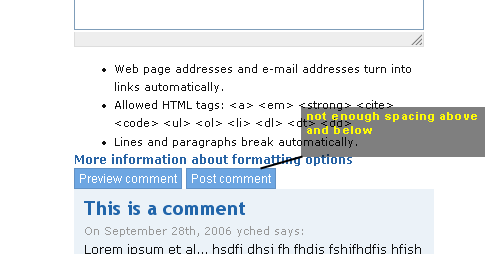
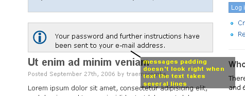
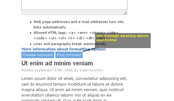
This is looking really nice. Thanks to both of you for this job. I won't enter the "white-space" or "blue search bar" debates. Or any aestethic one for that matter... I just wanted to point out a few places where padding / margins could be fixed. I don't have a flicker account, so I'm posting these as attachements. Plus I only can repeat my previous comment on Farsheed's version : the primary links are not legible. The upper part of the blue gradient is too light, the text links don't come out unless I really focus on them. The hover state is OK, though. yched