Drupal 5.0 Theme - v2

First things first, Farsheed has done OUTSTANDING work on trying to incorporate a whole bunch of peoples ideas of what should or shouldn't be in the theme. Below isn't meant to be "open for discussion" per se. It is My Take[tm] on the direction I think the theme should go. If Dries likes it, cool, I hope everyone does too, but I know there will be those who absolutely hate my proposal. My "code" is based off of the 14.zip version that Farsheed put up. I still feel he's the best person to pull these changes together once everything is all settled, I hope I've not made too much of a mess for him. ;) I don't know how to use diff and all that stuff as he does. I just make things pretty[tm]. "My" Theme: http://themes.net/ WHILE you look at the theme above, keep in mind I've only worked on the Fixed version. That isn't to say that I won't work on the fluid version too. Also note that It is NOT a finished version. Below are the tweaks I want to implement of which I feel will push this theme over the edge and make it worth of Drupal 5.0 default theme: * Rounded Corners Yes, we love them don't we? I would like to have rounded corners on the following areas [current colors kept in tact]. 1. Search area 2. Mission 3. Footer If you have Inkscape [ http://inkscape.org ] create a rectangle and click the rectangle select and set Rx and Ry to either 8 or 13. Those are the corner radii I'm thinking of using. I know how to implement a "pure html" way to do rounded corners with no images { as can be seen on my bands site -- yes, it's crappy looking -- http://theinterference.com/ } But wanted to discuss this implementation with maybe Ted, Farsheed, others as to what would be the best way technically to implement the rounded corners. My way I think is smooth and clean, and works on all browsers, but does put a lot of extra mark-up. Do we want that much extra mark-up going into a core theme? * Search bar and Footer bar Texture... these areas will have a nice clean texture in the background (of course, depending on the method we use for rounded corners) But the texture will really make those areas pop. I'll work on this tomorrow. I might simply repeat the "Glassy" feel from the Primary links to those areas. * Secondary Links I'd say we should have a place for Secondary links built into the top search bar, much like the Primary links. These are probably just small font links left aligned. * Logo on Right Not sure which logo to use... There are several Drupal Icon's laying around and wanted to know which is the "official one". This could tie into the "change the logo" discussion we had earlier. Would be nice to at least get the ability to change the logo easily with AJAX goodness into Drupal 5.0 That's about it... If everyone hates this and loves Farsheeds better, my feelings won't be hurt. I figured I'd spend some time, and put up instead of shutting up. :) The way that Farsheeds theme worked, still works, 2col(l/r) and 3col as is displayed. Again, I haven't touched fluid, so I'd have to go back in and fix those things. I can dedicate the rest of this week to this project should everyone (read: Dries) approve of my work thus far, and possibly a wee bit more time after that. Peace love and Bananas, Trae "The Artist Formerly Known as Occy" PS. I hope I didn't forget anything that should have gone in this PS area. :) -- Trae McCombs || http://occy.net/ Founder - Themes.org // Linux.com

Trae McCombs wrote:
* Rounded Corners Yes, we love them don't we? I would like to have rounded corners on the following areas [current colors kept in tact]. 1. Search area 2. Mission 3. Footer
Well, there is a Rounded Corners jQuery plugin that works rather nicely. http://methvin.com/jquery/jq-corner-demo.html Though the corners aren't antialiased. --Jeff
On 9/27/06, Jeff Eaton <jeff@viapositiva.net> wrote:
Trae McCombs wrote:
* Rounded Corners Yes, we love them don't we? I would like to have rounded corners on the following areas [current colors kept in tact]. 1. Search area 2. Mission 3. Footer
Well, there is a Rounded Corners jQuery plugin that works rather nicely. http://methvin.com/jquery/jq-corner-demo.html
Though the corners aren't antialiased.
If possible, I'd LIKE to keep them antialiased. But for the first revision it might not be necessary. And depending on the colors we use, sometimes you can't tell unless you look really close. I hate using images, but.... if we have to, we have to. I'm open to discussion of how to implement. I would personally be willing to say include the images (as they could be re-used) and go with antialiased looking corners to give the nice look. --Jeff
-- Trae McCombs || http://occy.net/ Founder - Themes.org // Linux.com

On Wednesday 27 September 2006 20:33, Trae McCombs wrote:
* Rounded Corners
If possible, I'd LIKE to keep them antialiased. But for the first revision it might not be necessary. And depending on the colors we use, sometimes you can't tell unless you look really close. I hate using images, but.... if we have to, we have to.
I'm open to discussion of how to implement. I would personally be willing to say include the images (as they could be re-used) and go with antialiased looking corners to give the nice look.
--Jeff
The Open Source Answer(tm) would be to improve the jQuery plugin to support anti-aliasing. :-) (No, I'm not sure how exactly to do so as I don't know how the plugin works, but it's an avenue we should keep open.) -- Larry Garfield AIM: LOLG42 larry@garfieldtech.com ICQ: 6817012 "If nature has made any one thing less susceptible than all others of exclusive property, it is the action of the thinking power called an idea, which an individual may exclusively possess as long as he keeps it to himself; but the moment it is divulged, it forces itself into the possession of every one, and the receiver cannot dispossess himself of it." -- Thomas Jefferson

I'm open to discussion of how to implement. I would personally be willing to say include the images (as they could be re-used) and go with antialiased looking corners to give the nice look.
2-3 more divs are not too much. btw. did you try adding one more color to the theme? what about green? maybe the theme is blue too much... Jakub

I'm open to discussion of how to implement. I would personally be willing to say include the images (as they could be re-used) and go with antialiased looking corners to give the nice look.
2-3 more divs are not too much. btw. did you try adding one more color to the theme? what about green? maybe the theme is blue too much...
-1. Rounded corners, implemented as divs, breaks everything that is holy about CSS: semantic markup. If, to implement a feature, we have to do [div][div][div], then that's just the same as using <br> (unclosed XHTML deliberately, since this is the sort of hack years ago that CSS was supposed to save us from) to add whitespace, as opposed to CSS's margin, padding, or what have you. Browser hacks, bad. Abusing CSS, bad. -- Morbus Iff ( omnia mutantur, nos et mutamur in illis ) Technical: http://www.oreillynet.com/pub/au/779 Culture: http://www.disobey.com/ and http://www.gamegrene.com/ icq: 2927491 / aim: akaMorbus / yahoo: morbus_iff / jabber.org: morbus

Morbus Iff wrote:
...everything that is holy about CSS ... I'm glad you're acknowledging that this is a religious issue :-)
Seriously, concrete reasons such as "bad for accessibility" or even "violates the standard" are more compelling than "violates the philosophy" or "violates the intent of the standard." If nothing else, they make it easier for people unfamiliar with the issues to understand what's going on. (I'd never heard that multiple nested divs interfere with accessibility.) Gary
what's going on. (I'd never heard that multiple nested divs interfere with accessibility.)
You simplify it greatly. The intent of CSS is to separate the presentation of a document with its structure. No longer, for example, do we have: <p><font size="+2"><b><u>Yes!</u></b></font></p> Of the above, only one thing is truly important in regards to the document structure: that it is a paragraph. In a CSS world, the structure of the document is merely: <p>Yes!</p> Likewise, in a pre-CSS world, spacing was often handled via spacer gifs or <br>, or even the evil <p></p><p></p><p></p>. From the document structure (technically called the Document Object Model), what we've done while we don't with our whitespace is add three paragraphs with no value. A paragraph without words is not a paragraph. In a CSS world: <p></p><p></p><p></p><p>Right, s o anyways...</p> Becomes: <p class="section">Right, so anyways...</p> .section { margin-top: 40px; } Now, in a CSS world, there is absolutely nothing wrong with: <div class="part"> <div class="preamble"></div> <div class="contents"></div> <div class="introduction"></div> <div class="chapter" id="chapter_1"> <div class="section"></div> </div> </div> This is (relatively, for a quick example) strong document structure: each div has a meaning, and has been given a CSS class that represents its presentation. From the DOM standpoint, it is easy for us to, say, style just chapter, just the first chapter, just the section of chapter one, or what have you. With XSLT or an XML capable browser, we can query the model to "give us all chapters" or "give us all contents". From a jQuery standpoint, we can do the same thing. This is a strong DOM. Rounded corners, when implemented as CSS, traditionally pollute this DOM, in much the same way that all the empty paragraphs above did. For instance, I used the CSS rounded corners on Gamegrene.com, a site redesigned years ago. My divs for these corners are: <div id="banner_top"><div><div> ... </div></div></div> These extra, unnamed divs, serve only to satisfy background images (the rounded corners) applied to them. They have no "purpose" in the document structure, because they are not structure - they are merely widgets so that CSS can apply some presentation to them. They are presentation logic, mucking up my document structure. Much like the empty paragraphs above serve only to add whitespace, these nested divs serve only to add rounded corners. They are a modern day spacer.gif. And *that* is why I -1 to rounded edges, unless they are applied via jQuery, which does NOT mess with the DOM in a way that negatively affects my document (the modifications are applied by the client software, at user request, NOT hardcoded into the document itself). -- Morbus Iff ( they should rename controlled chaos to morbus droppings ) Technical: http://www.oreillynet.com/pub/au/779 Culture: http://www.disobey.com/ and http://www.gamegrene.com/ icq: 2927491 / aim: akaMorbus / yahoo: morbus_iff / jabber.org: morbus
Morbus Iff wrote:
You simplify it greatly. The intent of CSS is to separate the presentation of a document with its structure. No longer, for ...
This is (relatively, for a quick example) strong document structure: each div has a meaning, and has been given a CSS class that represents its presentation. From the DOM standpoint, it is easy for us to, say, style just chapter, just the first chapter, just the section of chapter one, or what have you. With XSLT or an XML capable browser, we can query the model to "give us all chapters" or "give us all contents". From a jQuery standpoint, we can do the same thing. This is a strong DOM.
Rounded corners, when implemented as CSS, traditionally pollute this DOM, in much the same way that all the empty ... some presentation to them. They are presentation logic, mucking up my document structure. Much like the empty Pedantry aside, this remains a religious argument. Terms like "pollute" and "mucking" are subjective, emotional terms that do not directly represent anything of objective value. Taking your example, it is still possible to query the DOM to find all chapters or contents. And *that* is why I -1 to rounded edges, unless they are applied via jQuery, which does NOT mess with the DOM in a way that negatively affects my document (the modifications are applied by the client software, at user request, NOT hardcoded into the document itself). And here's the flaw: It's not your document; it's a transient, internal representation.
The separation of presentation from content makes perfect sense when the HTML is the data. And that's the way things were in the early days, or with tools like FrontPage. But that's not the case for Drupal, where the data model is the SQL, and the presentation layer is the theme. The HTML generated by the theme is then presentation, along with the CSS. Issues such as whether the login block goes into the same sidebar as the calendar or the recent posts are captured by the HTML. Yes, clever enough CSS can rearrange divs from their natural order in the HTML, but that just illustrates the absurdity of taking a hard line. Decisions around which text can be displayed in alternative fonts are captured by <span> and related tags; these frequently have underlying semantics, but not necessarily. Or you get into arguments over whether a decision to visually emphasize a word is a semantic or presentational issue. Rather than going down this rathole, it just makes more sense to deal in real value. Does using clever HTML/CSS for rounded corners make it harder to maintain the theme? more so than other CSS cleverness? Does it create problems for the person looking at it? Is it harder to do client-side JavaScript because of is? In other words, focus on the impact on people, and not the impact on theoretical models. Gary
Pedantry aside, this remains a religious argument. Terms like "pollute" and "mucking" are subjective, emotional terms that do not directly represent anything of objective value. Taking your example, it is still possible to query the DOM to find all chapters or contents.
And? Finding the paragraph in a morass of HTML "tag soup" is has always been possible (and, in fact, there is a very strong parser called TagSoup that does so for dirty HTML) but that has stopped no one from heralding CSS as a godsend, the w3 validators as scripture, and clean markup as a badge of honor. [1] http://en.wikipedia.org/wiki/Tag_soup [2] http://home.ccil.org/~cowan/XML/tagsoup/ Is this a religious argument? Quite probably, but were I to write emails like, say, a chatroom, many folks would complain about the lack of punctuation, capitalization, readability, and forethought. I don't care what is generating my markup - I treat HTML as a representation of my data, and if the data is not in a clean form (with no element misused or semantically described), then I regard it as wrong.
And here's the flaw: It's not your document; it's a transient, internal representation.
I still control the storage of the data and the transformation of that data into a version suitable for your client's interpreter -- and, much like I may complain to my printing press that this is not PANTONE NUTSACK #23, I will complain to my software that there is absolutely no reason to have an empty <div> in our comments HTML output (last I checked). Your interpreter can interpret it however you'd like; as can mine and anyone else's. One of my interpreters is "View Source" and my brain. One of my interpreters is an archiving utility (such like the Library of Congress or archive.org). Another is my text editor, which doesn't so much "interpret" it as just display it to me verbatim.
The separation of presentation from content makes perfect sense when the HTML is the data. And that's the way things were in the early days, or with tools like FrontPage. But that's not the case for Drupal, where the data model is the SQL, and the presentation layer is the theme. The
I disagree. The meaning and use of data, and its storage, are different things. You can store a book in a tank of water, but that doesn't make the book very usable as data. I can store data in a database, but without a transformation of that data (to a CSV for reading via Excel, to HTML for reading via a browser, to Docbook for conversion to a Framemaker document), it is not entirely useful.
not necessarily. Or you get into arguments over whether a decision to visually emphasize a word is a semantic or presentational issue.
I do, actually. I take a very hardline against the use of <b> and <strong> vs. <i> and <em>. It drives me nuts that browser wysiwigs, like TinyMCE, show a "B" button representing "bold" and then write <strong> as an HTML tag. It makes absolutely no sense. How does it know that I wanted to semantically emphasize the word vs. merely make it stand out more in the presentation layer?
Rather than going down this rathole, it just makes more sense to deal in real value. Does using clever HTML/CSS for rounded corners make it harder to maintain the theme? more so than other CSS cleverness? Does it create problems for the person looking at it? Is it harder to do client-side JavaScript because of is? In other words, focus on the impact on people, and not the impact on theoretical models.
My focus on real value is whether the document is structurally sound and easily reusable when I have no way of accessing the data in another way (say, making my own SQL queries against your database). I wrote an entire book [3] on how to scrape and spider data from the Web, because the structure of the data was either a) not transparently usable to me or others, or b) because the underlying sites expected (or enforced) their data as being useful to nothing but a web browser. This is folly; I liken HTML+CSS to XML+XSLT. You'd never think of putting useless elements in an XML document solely to satisfy the XSLT transformation, and I take the exact reasoning on HTML and CSS. -- Morbus Iff ( relax have a happy meal ) Technical: http://www.oreillynet.com/pub/au/779 Culture: http://www.disobey.com/ and http://www.gamegrene.com/ icq: 2927491 / aim: akaMorbus / yahoo: morbus_iff / jabber.org: morbus

"My" Theme: http://themes.net/
cooool :)
* Rounded Corners Yes, we love them don't we? I would like to have rounded corners on the following areas [current colors kept in tact]. 1. Search area 2. Mission 3. Footer
I like rounded corners. But I don't like the various approaches I've seen using images and extra markup.
I know how to implement a "pure html" way to do rounded corners with no images { as can be seen on my bands site -- yes, it's crappy looking -- http://theinterference.com/ } But wanted to discuss
This is interesting. No images? Still, I think the jQuery corners script is much more elegant. I don't really notice the aliasing in my browser.
* Search bar and Footer bar Texture... these areas will have a nice clean texture in the background (of course, depending on the method we use for rounded corners) But the texture will really make those areas pop. I'll work on this tomorrow. I might simply repeat the "Glassy" feel from the Primary links to those areas.
Cool. Interested to see what you do with this.
* Secondary Links I'd say we should have a place for Secondary links built into the top search bar, much like the Primary links. These are probably just small font links left aligned.
I like the concept of the top bar, but it does (as a barrage of people have noted) push down the page slightly. Many reduce some of the padding on this? It would create a nice space for secondary links though.
* Logo on Right Not sure which logo to use... There are several Drupal Icon's laying around and wanted to know which is the "official one". This could tie into the "change the logo" discussion we had earlier. Would be nice to at least get the ability to change the logo easily with AJAX goodness into Drupal 5.0
I think the AJAX stuff should stay out of this for now, as it adds more work to the already endless pile :)
I can dedicate the rest of this week to this project should everyone (read: Dries) approve of my work thus far, and possibly a wee bit more time after that.
Keep at it, I'd really like to see more. The more variations and ideas thrown in the better, I say. Farsheed __________________________________________________ Do You Yahoo!? Tired of spam? Yahoo! Mail has the best spam protection around http://mail.yahoo.com

I quite like the new alterations. I won't go into committee mode and start nit-picking but I will talk about;
* Rounded Corners
I like the idea a lot. It's very 2.0 and stuff. I appreciate the hard work you put into your http://theinterference.com/, no images version. However standards support and XHTML is about *removing* as much non semantic markup as possible. I don't think that a core drupal theme should be putting in 10+ extra divs per rounded box. It is not the correct approach for a site that claims any kind of accessibility. Taking advantage of the jQuery plugin is a good approach, however it does not alias (pointed out) and it takes a fraction of a second to work, resulting in a flash of squareness (nit-picking). It also seems hackish to me and will not work if javascript is disabled, and/or old. The only approach I've seen that uses the minimum of extra markup, allows any kind of corners (aliased?) and uses the least number of images is the sliding doors technique. Just some thoughts. Thanks Adam
P.S. Not that I'm blowing my own trumpet but http://www.salienttraits.com uses the sliding doors technique. It uses three images, relies on the fixed width and could have been reduced to two images if I hadn't been using transparency and a background image. Adam

On Wednesday 27 September 2006 18:22, Trae McCombs wrote:
I know how to implement a "pure html" way to do rounded corners
Regarding rounded corners, the jquery plugin and such... The jquery module works by inserting lots of elements styled in some magical way that produces the roundedness. After those elements are inserted, its not so different from what you've added to your markup. Depending on the radius of the round, it inserts a lot more elements than your 4 or 5. So I'm suggesting this: in your theme, markup your boxes simply, just using one div. Then have some jquery, far simpler than the rounded corners plugin, which inserts the extra wrappers. Keep your css the way it is. The rounded corners would only display when javascript is enabled, but that might be enough. Just a thought, -Dave

Regarding rounded corners, the jquery plugin and such...
The jquery module works by inserting lots of elements styled in some magical way that produces the roundedness. After those elements are inserted, its not so different from what you've added to your markup. Depending on the radius of the round, it inserts a lot more elements than your 4 or 5.
Wild and crazy idea #37: Why not generate the rounded corners, anti-aliased even, as images created on the fly? If GD is compiled in, use that. If not, how hard can it be to write the algorithm in fine-tuned PHP code? It can be done in all integer math, although that's probably not the slow part of doing this.

On 9/29/06, Chris Johnson <chris@tinpixel.com> wrote:
Regarding rounded corners, the jquery plugin and such...
The jquery module works by inserting lots of elements styled in some magical way that produces the roundedness. After those elements are inserted, its not so different from what you've added to your markup. Depending on the radius of the round, it inserts a lot more elements than your 4 or 5.
Wild and crazy idea #37:
Why not generate the rounded corners, anti-aliased even, as images created on the fly? If GD is compiled in, use that. If not, how hard can it be to write the algorithm in fine-tuned PHP code? It can be done in all integer math, although that's probably not the slow part of doing this.
This would be a waste of CPU cycles me thinks for every request. It would be better (resource wise) to generate that off line and add the image to the theme without that overhead. Think of those on shared hosting ...

He said "on the fly". On 9/30/06, Moshe Weitzman <weitzman@tejasa.com> wrote:
This would be a waste of CPU cycles me thinks for every request.
he didn't say to do it on every request . please lets not send another thread down the wrong track. naturally one would want to cache such images as long as possible.
On Friday 29 September 2006 12:22, Chris Johnson wrote:
Wild and crazy idea #37:
I had lost count. ;)
Why not generate the rounded corners, anti-aliased even, as images created on the fly?
I'm all for rounded corners, whether by javascript, GD-created images, or whatever else. But I say put them in a module that can be configured to work with most themes. I don't think they belong in the default theme. -D

Nice theme, I played a bit with it in web developer, please consider this or a nice border to #page #home { background: #ddd; }
There was some good feedback this morning. Here are my responses to the majority of the issues you guys/gals brought up. 1. Too much "wasted space" at the top. Name a single high-profile website: slashdot.org, digg.com, newsvine.com, others any of these that doesn't waste the top 300px+ of their site with ads or other stuff. You simply won't find it. Also, look at the Kubrick, it too pushes content down. It is a high resolution world. If you aren't at 1024 (Full screen browser) then you are going to get left behind. Me, I keep my browser window at 1024x700 (and have Web Developer toolbar resolution to easily switch to 800x600) -- no matter what desktop resolution I happen to be using. I can probably play with the top bar and shave off 10px here or there, but you do NOT want to cramp and close in your Search form element. It has to have room to breathe. It won't seem like such a huge void if we get secondary links in, or if I do some visual goodness in that area. 2. Rounded corners I would be open to discussing this by committee, as I know I'm not the expert on mark-up. http://occy.net/tmp/rounded_corners.html [UGLY COLORS] The above uses no images, only mark-up and css. But isn't anti-aliased. {view src on it} 3.Color Scheme. The reason I stayed with the same colors, is that is what Dries wanted. I personally don't dislike them, but feel the palette would be better served having one or two more colors tossed in (But used sparingly) to the mix. 4. Technical issues. If there are any other details that need to be handled besides "making the vision come alive", then I'll have to defer to others. I'm great at white space and Design, and I know a LOT of css, but aside from that... I'll happily defer to others on technical issues. Keep checking the site today, I've got some nifty ideas I'm working on. I'll check back in after lunch. Peace Love and Bananas, Trae On 9/27/06, Trae McCombs <traemccombs@gmail.com> wrote:
First things first, Farsheed has done OUTSTANDING work on trying to incorporate a whole bunch of peoples ideas of what should or shouldn't be in the theme. Below isn't meant to be "open for discussion" per se. It is My Take[tm] on the direction I think the theme should go. If Dries likes it, cool, I hope everyone does too, but I know there will be those who absolutely hate my proposal.
My "code" is based off of the 14.zip version that Farsheed put up. I still feel he's the best person to pull these changes together once everything is all settled, I hope I've not made too much of a mess for him. ;) I don't know how to use diff and all that stuff as he does. I just make things pretty[tm].
"My" Theme: http://themes.net/
WHILE you look at the theme above, keep in mind I've only worked on the Fixed version. That isn't to say that I won't work on the fluid version too. Also note that It is NOT a finished version. Below are the tweaks I want to implement of which I feel will push this theme over the edge and make it worth of Drupal 5.0 default theme:
* Rounded Corners Yes, we love them don't we? I would like to have rounded corners on the following areas [current colors kept in tact]. 1. Search area 2. Mission 3. Footer
If you have Inkscape [ http://inkscape.org ] create a rectangle and click the rectangle select and set Rx and Ry to either 8 or 13. Those are the corner radii I'm thinking of using.
I know how to implement a "pure html" way to do rounded corners with no images { as can be seen on my bands site -- yes, it's crappy looking -- http://theinterference.com/ } But wanted to discuss this implementation with maybe Ted, Farsheed, others as to what would be the best way technically to implement the rounded corners. My way I think is smooth and clean, and works on all browsers, but does put a lot of extra mark-up. Do we want that much extra mark-up going into a core theme?
* Search bar and Footer bar Texture... these areas will have a nice clean texture in the background (of course, depending on the method we use for rounded corners) But the texture will really make those areas pop. I'll work on this tomorrow. I might simply repeat the "Glassy" feel from the Primary links to those areas.
* Secondary Links I'd say we should have a place for Secondary links built into the top search bar, much like the Primary links. These are probably just small font links left aligned.
* Logo on Right Not sure which logo to use... There are several Drupal Icon's laying around and wanted to know which is the "official one". This could tie into the "change the logo" discussion we had earlier. Would be nice to at least get the ability to change the logo easily with AJAX goodness into Drupal 5.0
That's about it...
If everyone hates this and loves Farsheeds better, my feelings won't be hurt. I figured I'd spend some time, and put up instead of shutting up. :)
The way that Farsheeds theme worked, still works, 2col(l/r) and 3col as is displayed. Again, I haven't touched fluid, so I'd have to go back in and fix those things.
I can dedicate the rest of this week to this project should everyone (read: Dries) approve of my work thus far, and possibly a wee bit more time after that.
Peace love and Bananas, Trae "The Artist Formerly Known as Occy"
PS. I hope I didn't forget anything that should have gone in this PS area. :)
-- Trae McCombs || http://occy.net/ Founder - Themes.org // Linux.com
-- Trae McCombs || http://occy.net/ Founder - Themes.org // Linux.com

On 9/28/06, Trae McCombs <traemccombs@gmail.com> wrote:
Keep checking the site today, I've got some nifty ideas I'm working on. I'll check back in after lunch.
We need more modules enabled, more content types created, and more blocks enabled to really get a better idea of the theme. Greg -- Greg Knaddison | Growing Venture Solutions Denver, CO | http://growingventuresolutions.com Technology Solutions for Communities, Individuals, and Small Businesses

Trae McCombs wrote:
1. Too much "wasted space" at the top. Name a single high-profile website: slashdot.org <http://slashdot.org>, digg.com <http://digg.com>, newsvine.com <http://newsvine.com>, others any of these that doesn't waste the top 300px+ of their site with ads or other stuff. You simply won't find it. Also, look at the Kubrick, it too pushes content down. It is a high resolution world. If you aren't at 1024 (Full screen browser) then you are going to get left behind. These sites don't waste the top space, they use it. For ads. Top space is important space. I guess people think using this much space only for a search bar is a little meager.
Gaele

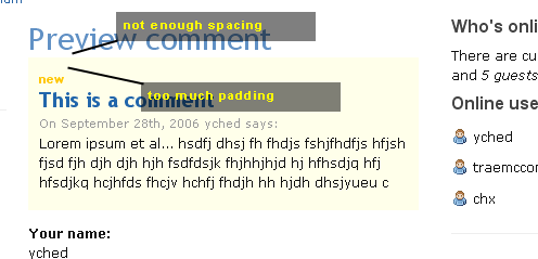
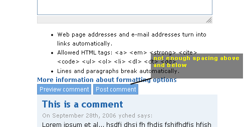
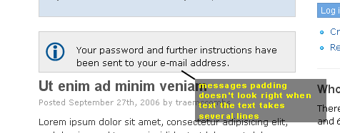
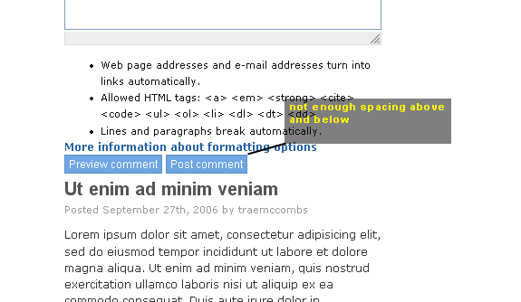
This is looking really nice. Thanks to both of you for this job. I won't enter the "white-space" or "blue search bar" debates. Or any aestethic one for that matter... I just wanted to point out a few places where padding / margins could be fixed. I don't have a flicker account, so I'm posting these as attachements. Plus I only can repeat my previous comment on Farsheed's version : the primary links are not legible. The upper part of the blue gradient is too light, the text links don't come out unless I really focus on them. The hover state is OK, though. yched
Those caps are Firefox 1.5 Win, BTW. yched

"My" Theme: http://themes.net/
*Great* job! Thank you! Your small tweaks make this version a definite improvement IMO. And the thick "plastic" bar in the top actually adds more balance to the header/title area. Suggestion (ignore if will): Make sidebars a tiny bit narrower and make their text smaller? On the demo site where both sidebars are enabled the main column seems a bit squashed... /Hannes - zoo33
participants (17)
-
 Adam Cooper
 -
 Chris Johnson
 -
 Dave Cohen
 -
 Farsheed
 -
 Gaele Strootman
 -
 Gary Feldman
 -
 Greg Knaddison - GVS
 -
 Hannes Lilljequist
 -
 Jakub Suchy
 -
 Jeff Eaton
 -
 Johan Forngren
 -
 Khalid B
 -
 Larry Garfield
 -
 Morbus Iff
 -
 Moshe Weitzman
 -
 Trae McCombs
 -
 Yves CHEDEMOIS